



Affiliate disclosure: The Amazon US product links in this article are affiliate links. If you buy through them, Read with Pro earns a small commission at no extra cost to you. If you are planning to buy, using these links helps us keep covering e-readers. As an Amazon Associate, Read with Pro earns from qualifying purchases.
In the Far Eastern Science Park in Xizhi, New Taipei, a company of about ten people is building a color e-paper display the opposite way from everyone else. SuperC-Touch (速博思) started out in touch sensing and fingerprint recognition. Its latest work is a 4.8-inch color e-paper sample whose defining feature is that you look at it "from the back": conventional e-paper is viewed from the ink film side, while SuperC-Touch flips the panel over and views it through the backplane glass.
Read with Pro visited SuperC-Touch on November 18 and spoke with Lee Hsiang-yu (李祥宇), chairman of SuperC-Touch Corporation, for more than twenty minutes. Using our own test images, we also compared the sample side by side with the Meebook M6C we brought and a mooInk Plus 2C that SuperC-Touch had prepared (both use Kaleido 3; both pages are in Chinese). Lee said the technical material he had sent us already explained everything, "it is just too technical for most people to follow," and asked us to put it in plain language. That is what this article does, breaking down three ideas: backplane viewing, aperture ratio and linear driving. (Quotes are translated from Mandarin.)
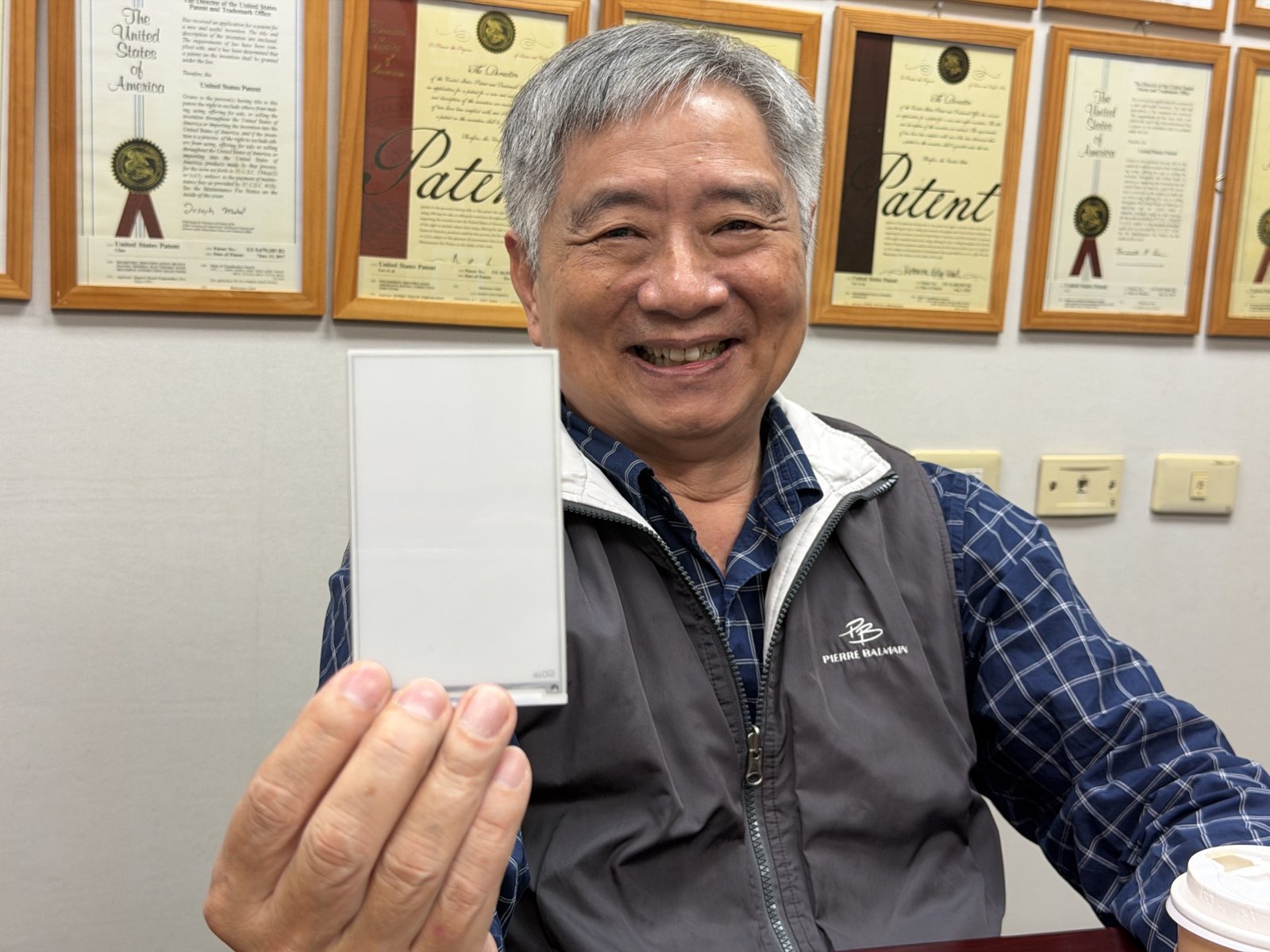
Caption: Lee Hsiang-yu, chairman of SuperC-Touch, with the company's US patent certificates on the wall behind him. Source: Read with Pro, photographed on site
If you only want the highlights, here they are:
- SuperC-Touch flips e-paper over and views it through the backplane glass, which lets it shrink the light-blocking circuitry. The company says the aperture ratio reaches 98%.
- This approach enables finer shading (96 gray levels) and more vivid color. In our side-by-side comparison, the sample's colors were clearly more saturated than on today's Kaleido 3 e-readers (our observation).
- For now it is only a 4.8-inch validation sample: 90 PPI in color, no front light or touch layer yet, and we have not seen it change pages.
- Small-size products could arrive as early as next year. The company says that at volume, costs could be roughly half those of today's color e-paper.
A note before we start: unless marked otherwise, the specifications, measurements and timelines in this article come from SuperC-Touch's own materials or from the interview (company figures). Read with Pro has not measured anything independently. What we saw with our own eyes is marked as "our observation." This article is based on a technical visit arranged by Read with Pro. It is not sponsored or a paid partnership, and it was written independently by Read with Pro.
From touch and fingerprint sensors to e-paper
Caption: The SuperC-Touch sign in the company's office. Source: Read with Pro, photographed on site
SuperC-Touch was founded in 2012 to develop in-cell touch, which builds touch sensing directly into the display panel. Lee said the approach was not yet common at the time and the team saw an opportunity, but in-cell only works in partnership with a major panel maker. The company was too small to find one willing to work with it, so the effort ended with discussions and patent filings.
The second step was fingerprint recognition. The team built fingerprint sensors on glass instead of the silicon wafers commonly used before, which Lee said can differ in cost by a factor of about a hundred. That brought costs down, and the sensors are now sold in small volumes in several countries. The work built up both panel design and IC design skills, and one project, an on-screen fingerprint sensor that sits on top of a display, required the circuits on the glass to be transparent. That ability later became the key to the company's e-paper work.
In 2023 SuperC-Touch took a scratch-resistance technology to E Ink for talks and realized its own know-how applied to e-paper, so the team started researching e-paper on its return. Lee stressed that this was not a sudden change of direction: touch, fingerprint sensing and e-paper all draw on the same family of technologies.
According to the company, SuperC-Touch has filed about 160 patents, of which more than 90 have been granted.
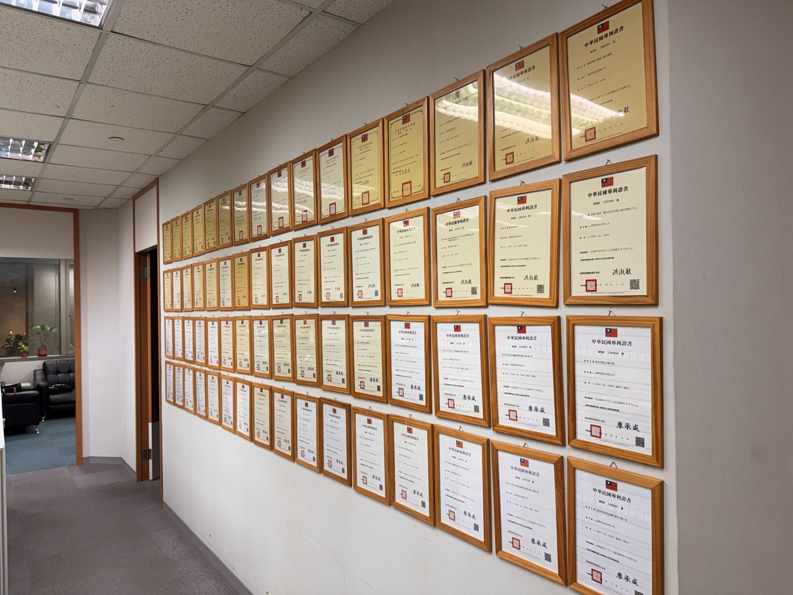
Caption: A corridor in the SuperC-Touch office lined with Taiwanese patent certificates. Source: Read with Pro, photographed on site
First, how does e-paper show an image?
Before getting to SuperC-Touch, it helps to spend a minute on how e-paper works. The e-paper in today's e-readers contains a layer of tiny microcapsules, each holding charged black and white particles. Applying a voltage under a pixel pulls the white particles to the surface, so the pixel looks white; reversing the voltage brings the black particles up instead. The particles stay where they are until the next change, which is why e-paper only uses power when the page changes.
E-paper does not emit light. Like paper, it reflects the light around it, which is why it stays readable in sunlight and feels easier on the eyes over long sessions. In the dark, a front light above the screen lights it up.
What about color? The most common color e-readers use E Ink's Kaleido series, which places a color filter on top of black-and-white e-paper, a bit like looking at a black-and-white image through colored cellophane. Light has to pass through the filter, reflect and pass back out, so brightness drops and colors look muted. Each color dot is made from several black-and-white pixels, so color resolution is half the black-and-white resolution; Kaleido 3, for example, is 300 PPI in black and white and 150 PPI in color. For how the different color e-paper technologies compare, see our Spectra 6 guide (in Chinese).
Keep three things in mind and the rest of this article will be easier to follow: e-paper works by reflecting light; every extra layer the light passes through makes the image a little darker; and how finely the image can be shaded depends on how precisely those particles can be controlled.
What does "viewing from the back" mean?
Think of e-paper as a sandwich. In the middle is the ink film, microcapsules holding black and white particles. On one side is the backplane glass that drives the pixels, covered with transistors and wiring; on the other side are protective films and layers of adhesive. For more than twenty years, mainstream e-paper has been viewed from the ink film side. The wiring on the backplane is opaque, so from that side it looks like a mirror and shows no image.
Lee's starting point is simple. Unlike an LCD, e-paper has no backlight; it forms an image by reflecting ambient light, so in theory it can be viewed from either side. If the backplane wiring is made transparent, you can look at the ink film through the glass, which is exactly what SuperC-Touch learned to do while building on-screen fingerprint sensors.
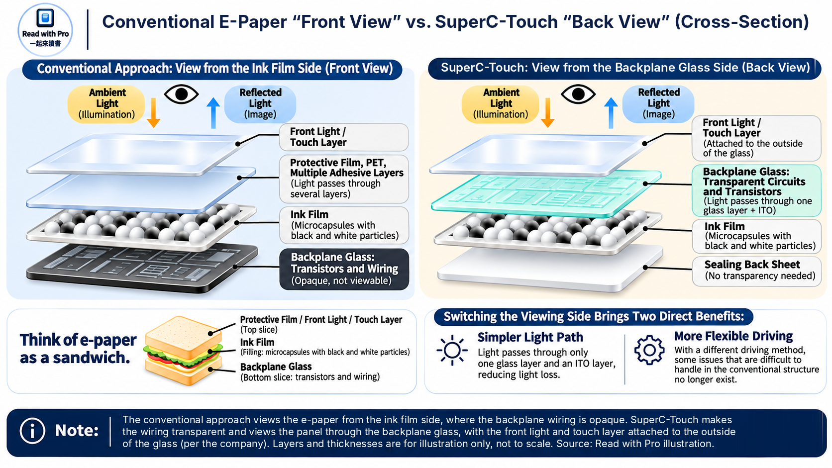
Caption: Conventional e-paper is viewed from the ink film side, and its backplane wiring is opaque. SuperC-Touch makes the wiring transparent and views the panel through the backplane glass, with the front light and touch layer attached to the outside of the glass (company figures). Layers and thicknesses are illustrative, not to scale. Source: Read with Pro illustration
Switching sides brings two direct benefits. First, light passes through fewer layers: Lee said light in the conventional structure travels through PET and several adhesive layers and loses a fair amount along the way, while SuperC-Touch's design has only one sheet of glass and one ITO transparent conductive layer. Second, as explained below, some problems that are hard to solve in the conventional structure simply do not exist once you view from the other side.
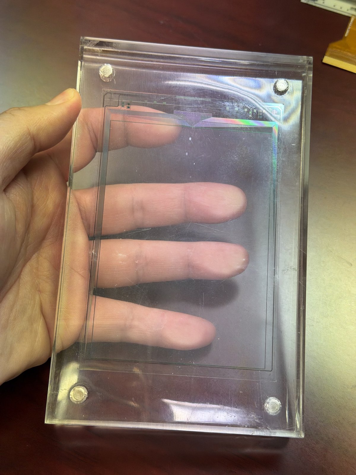
Caption: The transparent backplane glass shown on site. The fingers behind it are clearly visible, and only the wiring and contacts along the edges can be seen. Our observation. Source: Read with Pro, photographed on site
By choosing this side, he said, "I only have to solve one problem, transparency," while the conventional side has many problems to deal with. He was quick to add: "It's not that they aren't capable. They are very capable. If I had to work on the same side, I couldn't do it at all." These are the interviewee's views. E Ink's technical path has its own reasons, and Read with Pro is not in a position to judge which approach is better. A fair way to put it is that SuperC-Touch has applied the transparent-circuit skills it built in touch and fingerprint sensing to a direction mainstream makers have not taken.
Because the viewing side is now the backplane glass, the front light and touch layer move too. According to the company, both are attached to the outside of the backplane glass. For the basics of front lights, see our front light vs. backlight explainer (in Chinese).
A 98% aperture ratio: shrinking the transistors
The aperture ratio is the share of each pixel that actually displays the image. Because SuperC-Touch's panel is viewed through the backplane glass, the transistors and wiring on that glass sit directly in the line of sight, and the more area they take up, the darker the image. That makes the aperture ratio especially important for a back-viewed panel.
Think of each pixel as a window, with the transistors and wiring as the window frame. The thicker the frame, the less light comes in and the darker the room; make the frame thinner and the same window lets in more light.
Lee explained that conventional backplanes mostly use amorphous silicon. Amorphous-silicon transistors have high resistance, so the industry tends to make them large and sometimes connects two in series; viewed from the backplane side, those two transistors alone could take up about a third of the pixel. SuperC-Touch instead shrinks the transistors to a very small size. According to the company's materials, the 4.8-inch sample has an aperture ratio of 98%.
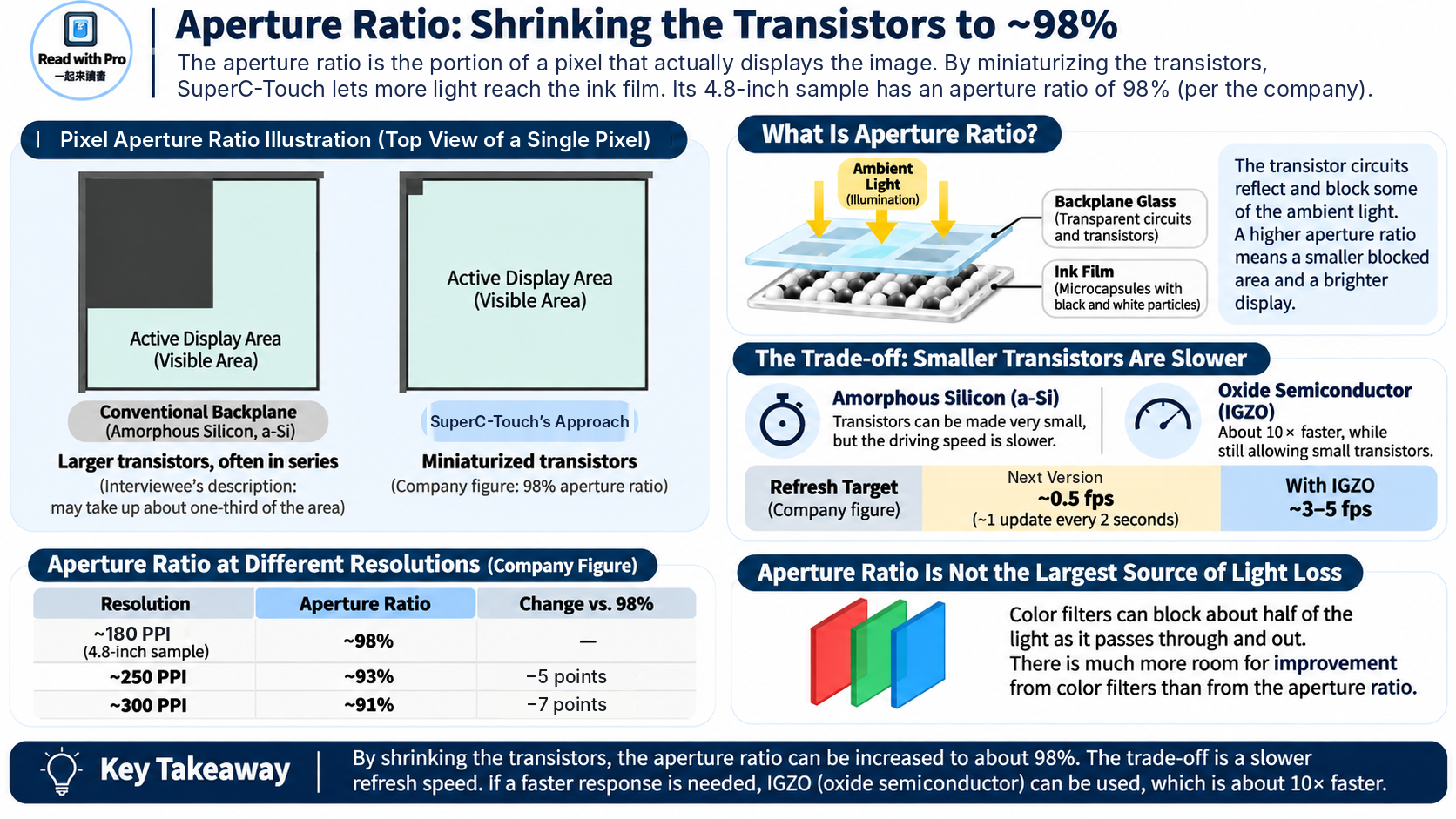
Caption: Large transistors as described by the interviewee (left) compared with SuperC-Touch's miniaturized transistors (right), plus the company's aperture ratios at different resolutions. Proportions are exaggerated for clarity. Source: Read with Pro illustration
The trade-off is speed. Smaller transistors still work, just more slowly. Lee said the team is not aiming for more than ten refreshes per second for now; the target is about one update per second. If that is not fast enough, an IGZO oxide-semiconductor process is roughly ten times faster and still allows small transistors. He added that amorphous silicon is cheap and widely available while few factories can make IGZO, so the process can be chosen to fit the product. In its written reply, SuperC-Touch gave refresh targets of about 0.5 frames per second for the next version and about 3 to 5 frames per second with IGZO (company figures). We did not see the sample change pages during our visit; SuperC-Touch said patents related to page turning are still pending, so it is not demonstrating or allowing filming of page turns for now. For the basics of refresh and ghosting, see our refresh and ghosting explainer (in Chinese).
Higher resolution lowers the aperture ratio. PPI is the number of pixels per inch; the higher it is, the smaller each pixel and the sharper the image. But every pixel needs its own transistor and wiring, so the smaller the pixel, the larger the share taken up by the "frame." Lee said that at 300 PPI the aperture ratio drops from 98% to about 91%, and at 250 PPI to about 93%. In his view, the lost 5 to 7 percentage points can be recovered elsewhere, for example in the color filter, where light loses about half its intensity on the way in and out. That leaves far more room for improvement than the aperture ratio does.
96 gray levels: why linear driving matters
The sample's other key number is 96 gray levels (company figure). Gray levels are the number of shades a display can show between black and white. More levels mean smoother shadows and gradients in photos; too few, and gradients break into visible bands. Color e-paper builds its colors from shades of red, green and blue, so more gray levels also mean more colors.
How many shades a panel can show comes down to how precisely it can control the particles. That is where linear driving comes in, the most technical part of the interview and the one most worth explaining.
Start with an analogy. Linear is like a volume knob: each notch makes it a step louder, so once you know the rule you can work out every notch. Nonlinear is like an old faucet: how much water comes out does not follow any pattern, so you have to try each position and write the result down. The bigger the table, the bigger the driver IC and the more tuning it takes. In e-paper, this table is called a waveform: it records how and for how long to apply voltage to reach each shade.
Why is conventional e-paper more like the old faucet? Below each e-paper pixel is a pixel electrode whose voltage can be controlled individually; above the pixels is a single shared common electrode. Lee explained that the lower electrode can be controlled precisely, while the upper one, being one continuous conductor, is "blurry" and is affected by neighboring pixels and resistance. The conventional structure shows you the particles on the upper side, so its response is highly nonlinear. The only way to handle that is extensive experimentation, filling the driver IC's waveform tables with every case and driving the panel by looking values up. He gave the example of a 16×16 waveform set with 256 combinations, which can take a year just to tune.
Viewed from the backplane side, you see the particles next to the precise electrode. Lee said this lets SuperC-Touch work in the linear region, and a linear relationship can be calculated, while a nonlinear one can only be found by experiment. That is why the team can tune a new ink film in a few days.
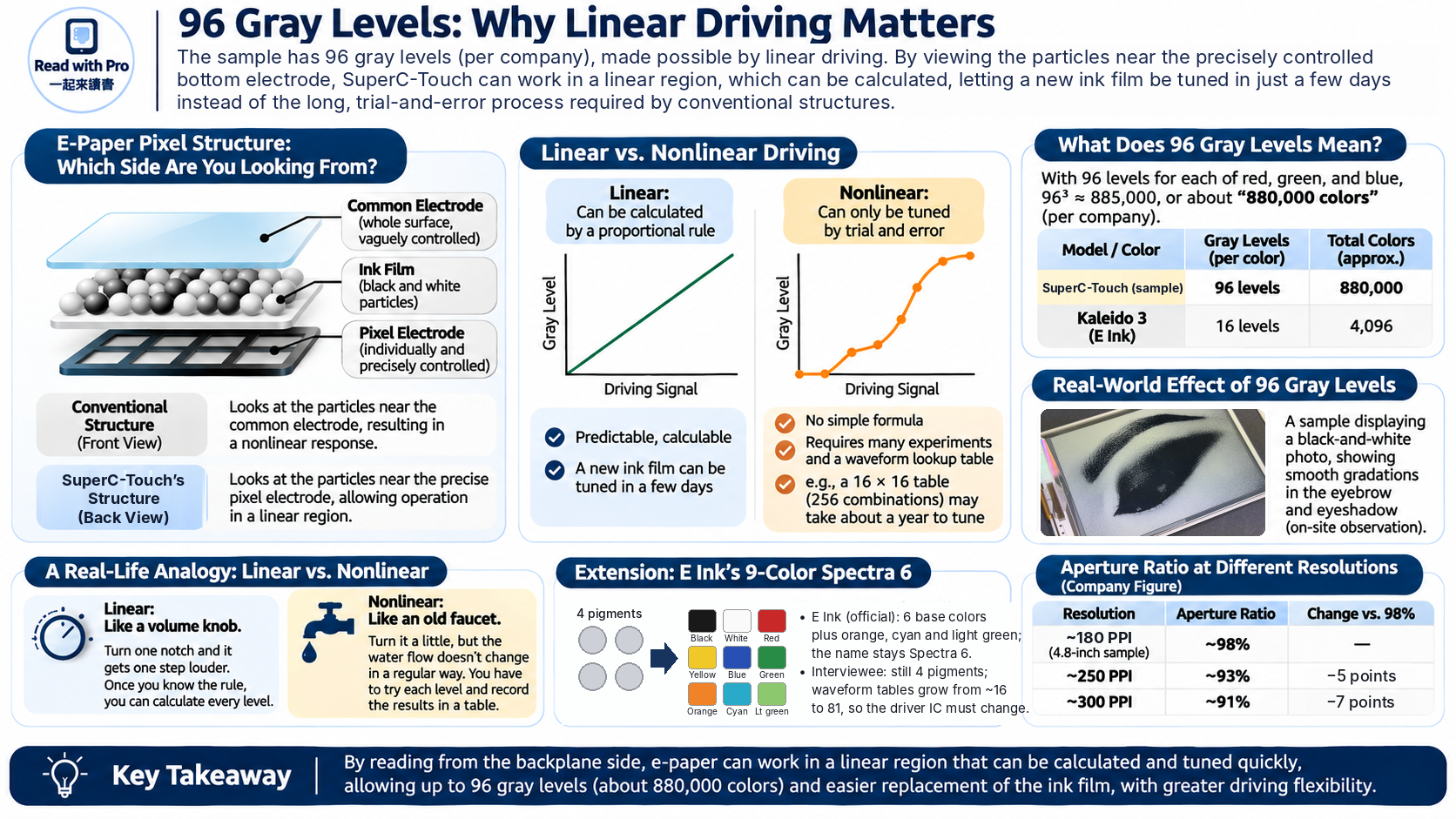
Caption: A linear relationship can be calculated proportionally; a nonlinear one has to be found step by step through experiments and lookup tables. Curves are conceptual, not measured data. Source: Read with Pro illustration
What do 96 gray levels mean? With 96 levels each for red, green and blue, 96 cubed is about 885,000, which matches the company's figure of "880,000 colors." E Ink's catalog lists 4,096 colors for Kaleido 3, which works out to 16 levels per color (our calculation). Lee also said during the interview that E Ink currently achieves 16 gray levels.
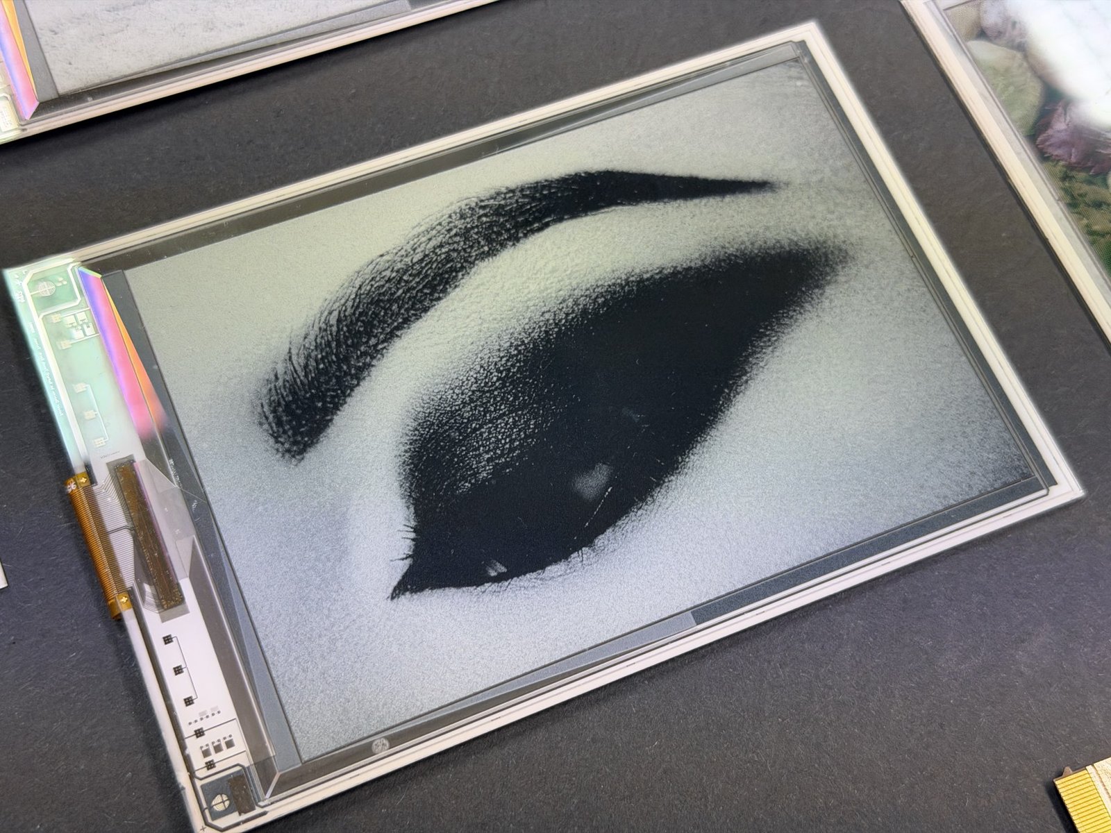
Caption: The sample showing a black-and-white photo, with smooth transitions in the eyebrow and eyeshadow. Our observation. Source: Read with Pro, photographed on site
Spectra 6 is the color technology E Ink uses in e-paper photo frames and indoor signage, not in e-readers, but it is a good illustration of how much driving matters. Lee used the same logic to explain E Ink's recent nine-color Spectra 6. Lee said the nine-color version "is really just four kinds of particles mixed together," that there are still only four basic particles, which is why the name stayed Spectra 6, and that only the driving method changed. By his estimate, pairing four particle types takes 16 waveform tables, while nine colors require 81, so the driver IC must change as well. This lines up with our earlier coverage: Spectra 6 uses four pigments to show six colors and mixes the rest algorithmically, and the nine-color version announced in November is indeed still called Spectra 6 (both in Chinese). The waveform table counts, however, are the interviewee's estimates; E Ink has not published those details.
The numbers: brighter and more colorful, contrast still catching up
First, the sample's specifications (company figures): 4.8 inches, 720×500 resolution, 180 PPI in black and white and 90 PPI in color, 140-micron pixels, 96 gray levels and 880,000 colors, with a 98% aperture ratio. It uses E Ink's black-and-white ink film, glass made by Giantplus (凌巨), and a driver IC designed in house; the production driver IC is expected to take about another year.
SuperC-Touch also shared its own measurements, taken with a Nix Spectro color meter, along with readings from the same instrument on a Kaleido 3 panel. Here is what the three numbers mean: reflectance is how much light the white background reflects, so higher means a brighter white; contrast is the difference between the whitest white and the darkest black, so higher means crisper text; and color gamut is the range of colors the display can show, measured here against the common NTSC color standard, so larger means more vivid color.
| Item | SuperC-Touch 4.8-inch sample | Kaleido 3 |
|---|---|---|
| Reflectance | 18% to 20% | 16% to 18% |
| Contrast | Above 20 | Above 25 |
| Color gamut (NTSC) | 7% to 9% | 2% to 3% |
Source: SuperC-Touch (company figures); not independently measured by Read with Pro.
By the company's own numbers, the sample leads in reflectance and color gamut, while Kaleido 3 has the higher contrast. Note also that the comparison is with Kaleido 3. E Ink says Kaleido 4, announced in October, raises white-state reflectance by 15% and contrast by 50% over Kaleido 3 (see our Kaleido 4 press release breakdown, in Chinese), so the gap may change once Kaleido 4 products are available for comparison.
Lee was cautious about reflectance. He believes real-world measurements are about 18%, not quite 20%, because the makeup of the microcapsules varies from batch to batch, some brighter and some darker, so a reasonable range is 18% to 20%.
He also said there is room to improve. SuperC-Touch uses the black-and-white ink film E Ink supplies for electronic shelf labels (ESL), not the one used in Kaleido 3 e-readers, and he suspects the two use microcapsules of different grades. SuperC-Touch gains on light loss but loses on ink film, and the two roughly cancel out, putting it close to Kaleido 3. "I don't think E Ink can't do it. They just haven't brought out their best," he said. He estimates that a better ink film could raise reflectance by another 20% to 30%, depending on how ink materials improve.
Keep in mind that this is a bare panel without a front light or touch layer. Asked what happens once those are added, Lee was direct: adding touch and a front light takes off roughly another 10% to 15%.
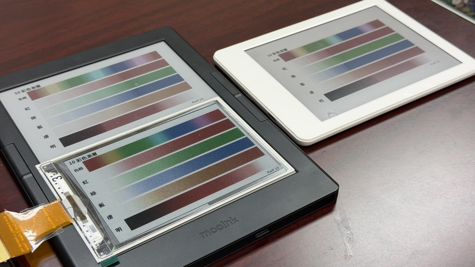
Our observation: using Read with Pro's own test images, we placed the sample on top of the Readmoo mooInk Plus 2C (7.8-inch Kaleido 3) that SuperC-Touch had prepared, with the Meebook M6C we brought alongside, all showing the same image. The clearest difference was color. On the color-block and Mona Lisa images, the sample's reds, greens, blues and magentas were much more saturated than on either Kaleido 3 reader, consistent with the company's gamut figures. We could not see an obvious difference in white brightness in our photos, but photos depend on angle and exposure, so we do not judge brightness from them. Up close, a fine grid pattern is visible on the sample, which relates to its 90 PPI color resolution.
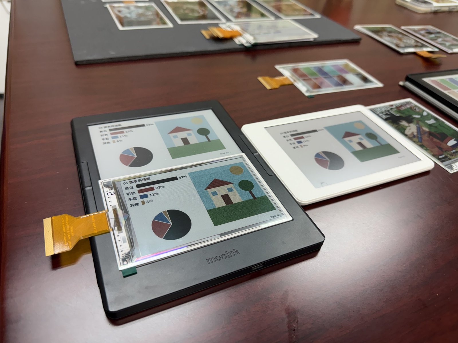
Caption: The comparison setup. On the left is the SuperC-Touch sample placed on the mooInk Plus 2C; the white device on the right is the Meebook M6C. All three show the same Read with Pro chart test image. Source: Read with Pro, photographed on site
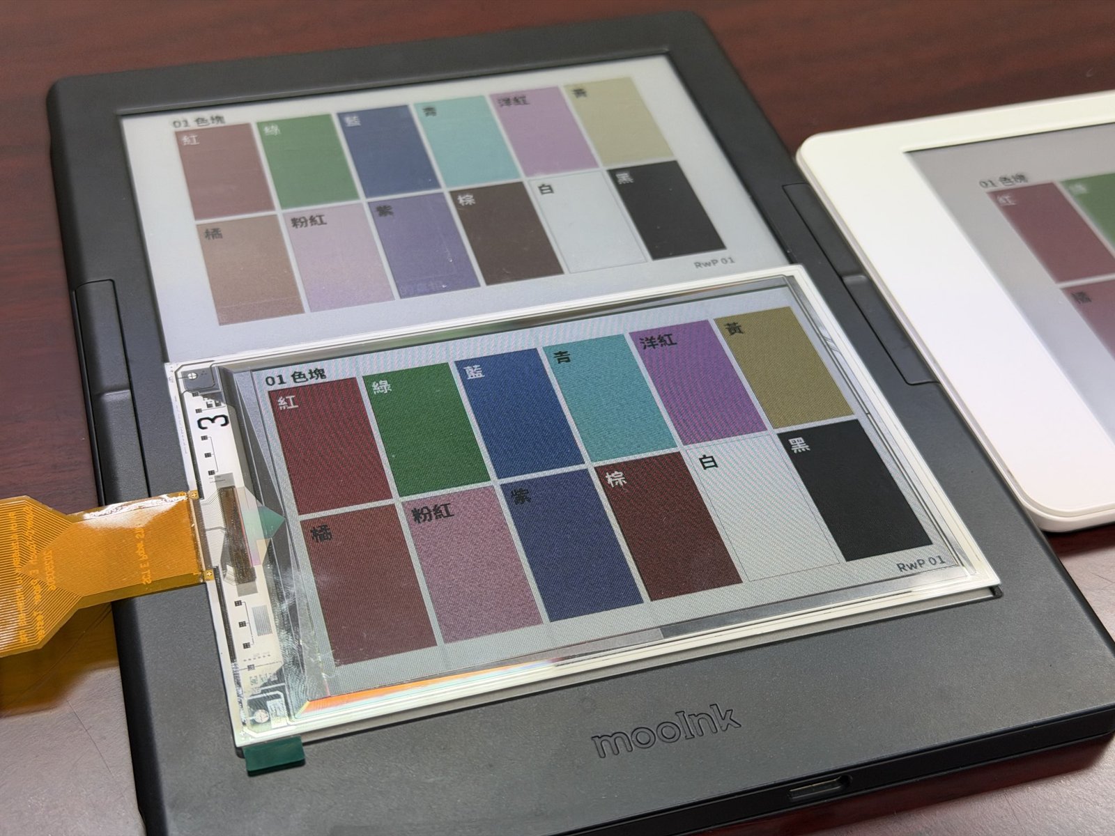
Caption: Read with Pro color-block test image. The SuperC-Touch sample is at the bottom, the mooInk Plus 2C prepared by SuperC-Touch is at the top, and the white device at the right edge is the Meebook M6C we brought. Our observation; the finished readers and the bare panel are not compared under equal conditions (see text). Source: Read with Pro, photographed on site
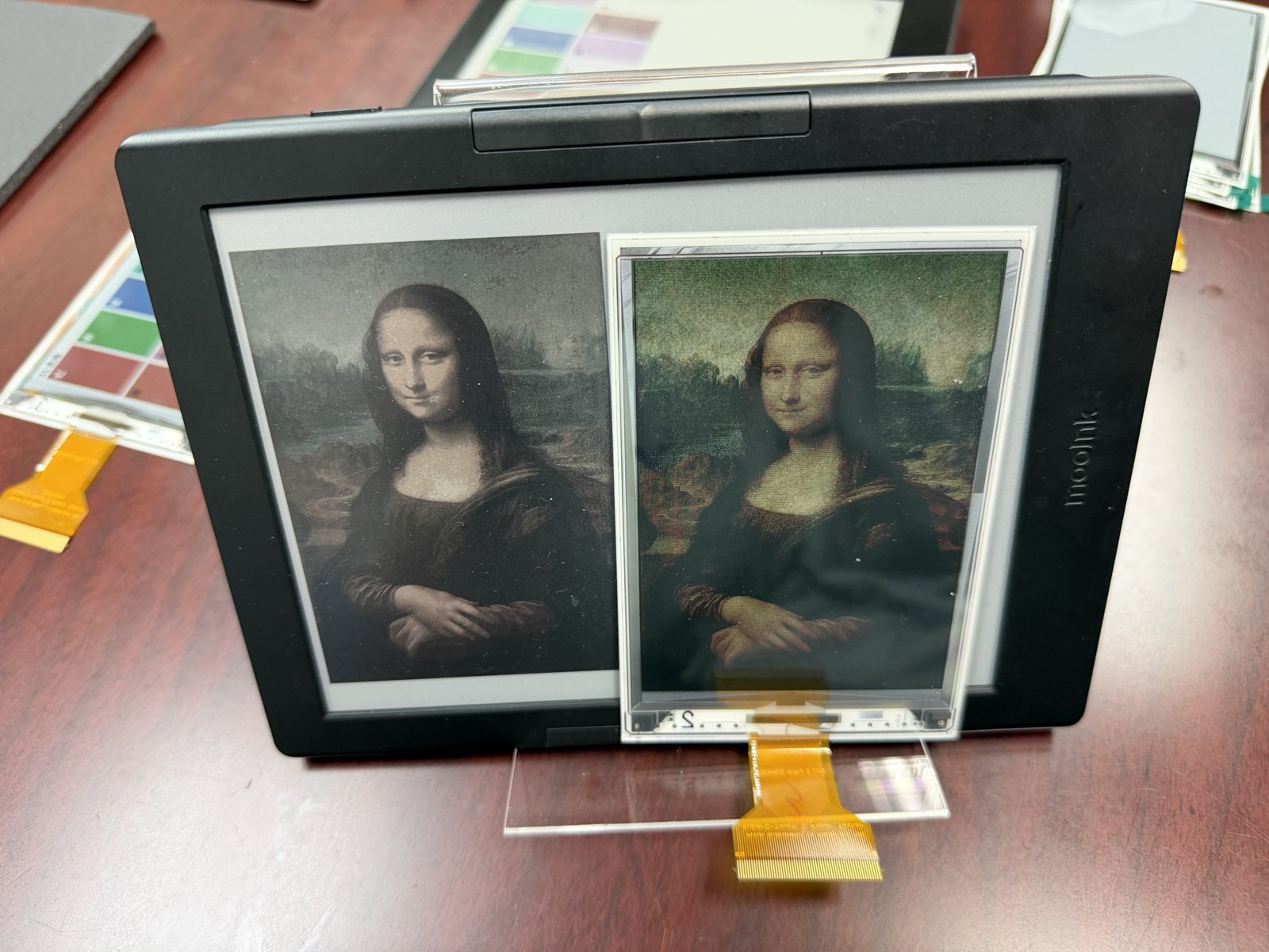
Caption: The mooInk Plus 2C on the left and the SuperC-Touch sample standing in front on the right, both showing the same Mona Lisa image. Our observation. Source: Read with Pro, photographed on site
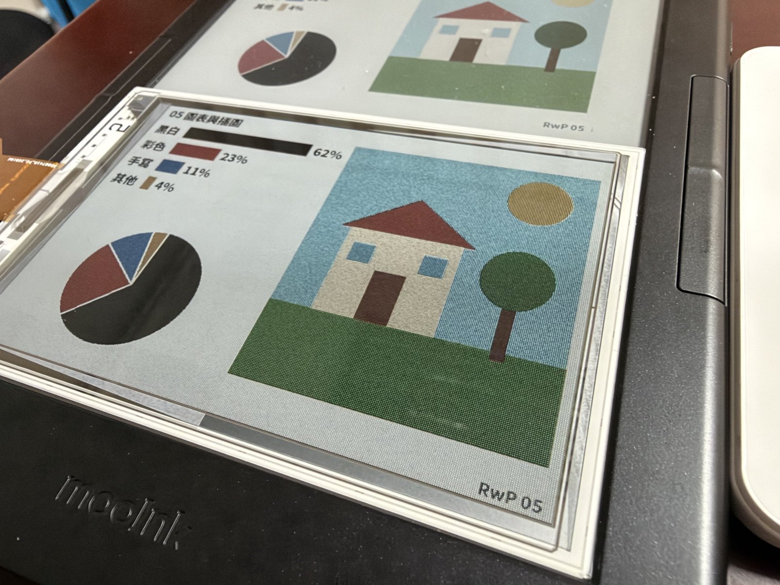
Caption: A close-up of charts and illustrations on the sample. Colors are saturated, but a fine grid pattern is visible up close. Our observation. Source: Read with Pro, photographed on site
The two sides were not compared under equal conditions. The Meebook M6C is a finished reader with a touch layer, and its front light was off during shooting. The mooInk Plus 2C is also a finished reader, prepared by SuperC-Touch, and its front light was also off during shooting. The SuperC-Touch sample is a bare panel with neither a front light nor touch, so part of the difference in the photos comes from the extra layers in the finished readers. By Lee's estimate, the sample will lose another 10% to 15% of its brightness once a front light and touch are added.
When can you buy one, and will it be cheaper?
Not yet. The company's timeline calls for a 4.5-inch mass-production-ready sample in about six months, small-size products in the fourth quarter of 2027 and a wider range of products in 2028. Lee said in the interview that small sizes could arrive as early as next year. He was also candid that many companies want to use the panel after seeing it, including makers of small accessories and e-readers, but the company has only about ten people, and "the problem is we have nothing to give them."
This also reflects how SuperC-Touch operates. According to the company, it is a technology development and licensing company that mainly designs the panel structure and driver IC; mass production requires partnering with panel makers. For this sample, for instance, the glass was made by Giantplus and the ink film came from E Ink. Turning the technology into photo frames, accessories or e-readers that readers can buy also requires brands willing to adopt it. So when it reaches the market depends not only on SuperC-Touch's own development, but also on whether it finds partners.
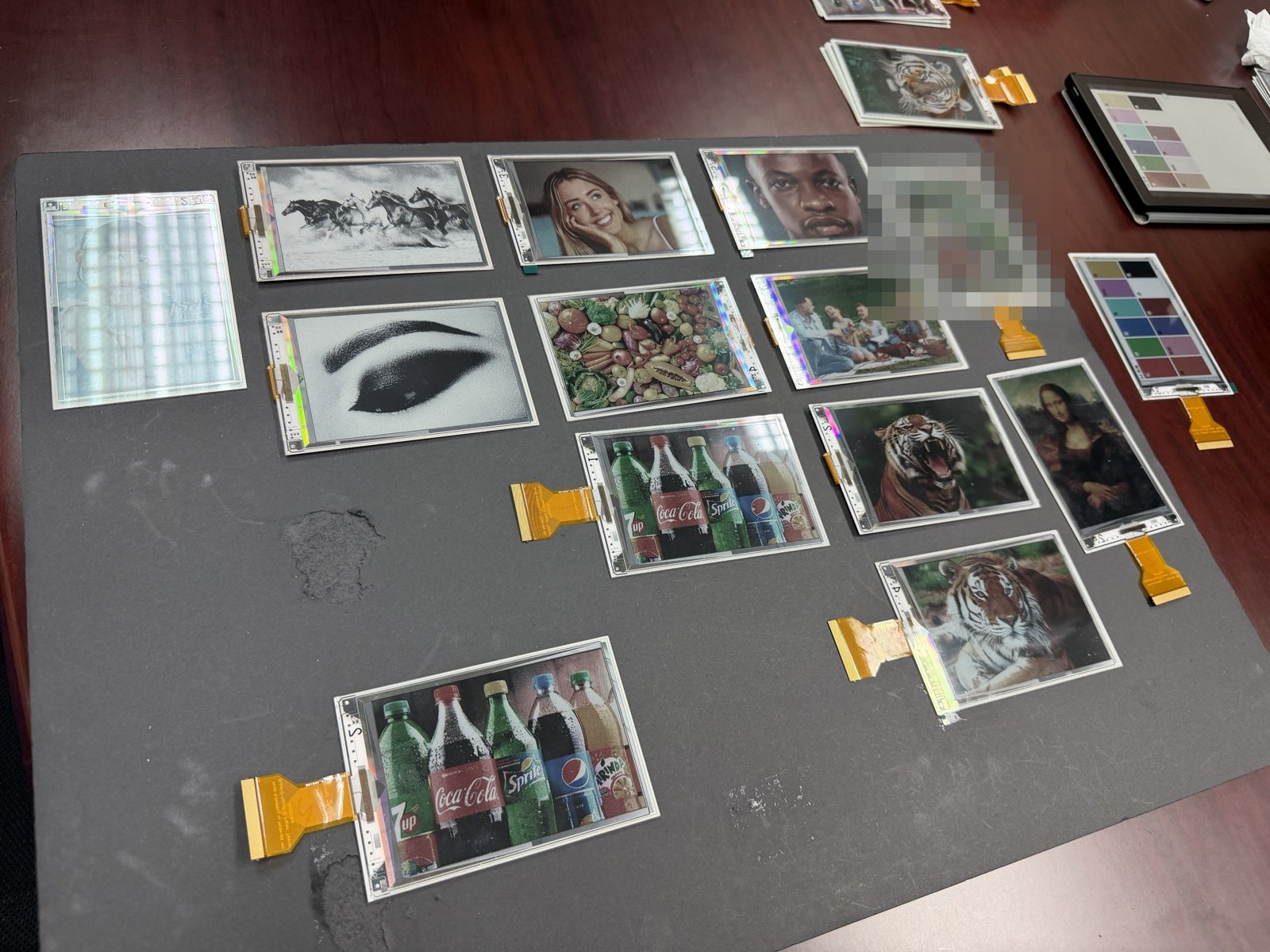
Caption: To show us how different kinds of images look and what the panels could be used for, Lee prepared a full table of samples. One sample at the upper right showing a copyrighted comic cover has been pixelated. Source: Read with Pro, photographed on site
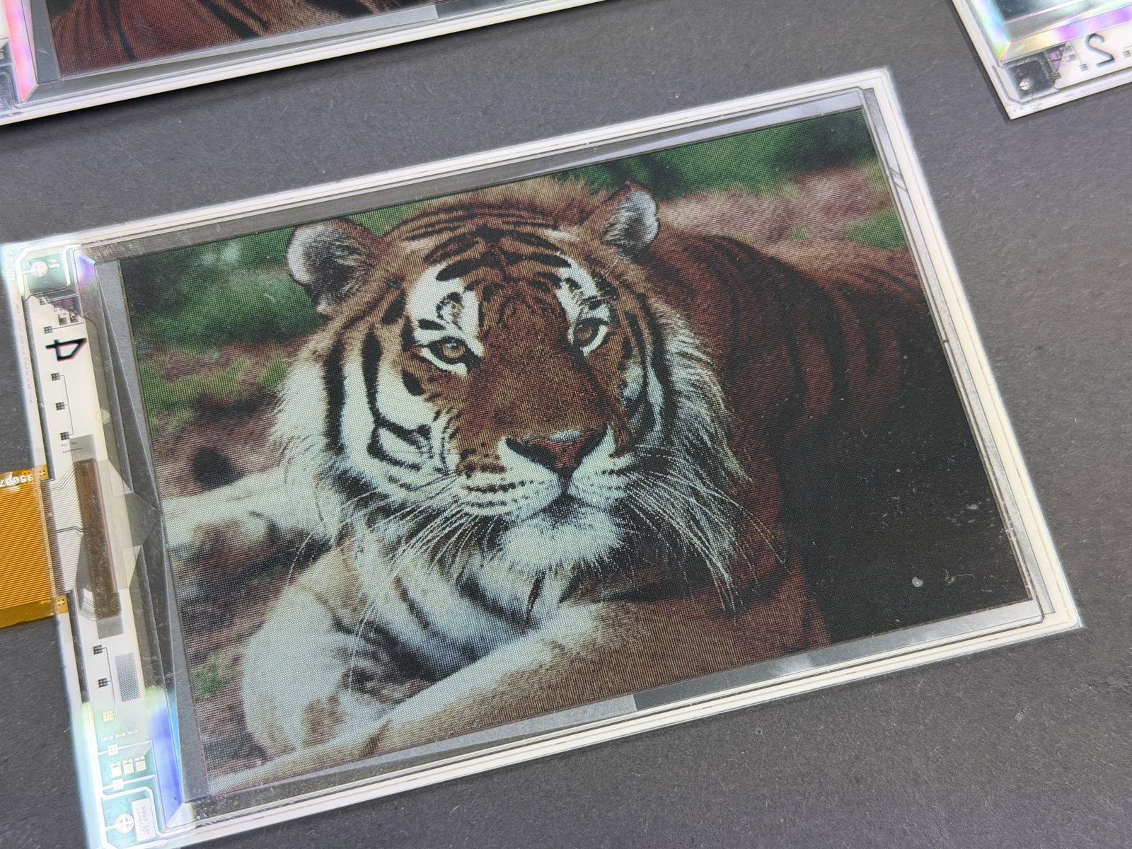
Caption: One of the color samples SuperC-Touch showed on site. Our observation. Source: Read with Pro, photographed on site
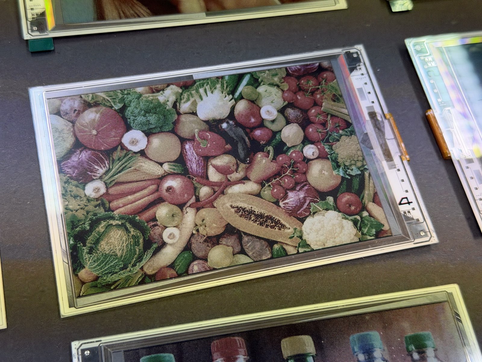
Caption: Another color sample showing a photo of vegetables, with reds, greens and oranges clearly distinguishable. Our observation. Source: Read with Pro, photographed on site
The 90 PPI color resolution is a trade-off at this stage. Compared with the 150 PPI color typical of Kaleido 3 readers such as the M6C, the sample's color resolution is clearly lower. Lee said this is a first batch for validation, mainly to confirm that it works; the team deliberately made the pixels larger so images would appear bigger, and plans to move to higher resolutions later.
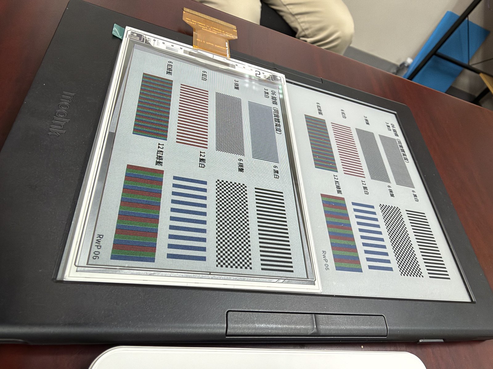
Caption: Read with Pro fine-line test image with colored lines of different widths and a black-and-white checkerboard. The SuperC-Touch sample is at the upper left, on top of the mooInk Plus 2C, so the two can be compared on fine lines. Source: Read with Pro, photographed on site
Cost is where SuperC-Touch is most confident. According to the company, production currently costs about 20% more than black-and-white e-paper, and at volume it could be about 50% cheaper than current color e-paper. Lee's reasoning starts with the Kindle: black-and-white and color Kindles differ by about US$100, and he believes the difference is mainly the screen, so today's color panels cost at least twice as much as black-and-white ones. He added that E Ink ships in high volume and SuperC-Touch does not, so even though its structure uses fewer materials, its cost of materials is higher; the gap would start at around 50%, with room to reach 70% to 80% once volumes grow.
We checked the Kindle price gap. Amazon's US list prices announced in October 2026 start at US$199.99 for the Kindle Paperwhite 16GB (Amazon US) and US$289.99 for the Kindle Colorsoft 16GB (Amazon US), a difference of US$90, or about 45% more for color (Amazon announcement). That is close to Lee's "about US$100" (all Amazon links above are affiliate links). These are list prices. According to our Amazon Black Friday Kindle deals roundup (in Chinese) from November 20, none of the 2026 models are discounted for Black Friday, so the gap still holds during the sale; the discounts are concentrated on previous-generation models, so readers hoping to buy during Black Friday can check that article. The price gap also reflects pricing strategy and other spec differences, so it is not the same as the panel cost (our inference). Kindles are not officially sold in Taiwan, so readers here usually buy from Amazon US; for how prices rose this year, see our Kindle price hike roundup (in Chinese).
Our take
What makes SuperC-Touch's sample stand out is that it does not squeeze a few more percentage points out of an existing approach. By flipping the viewing side, it changes the aperture ratio, gray levels and tuning speed all at once. For readers in Taiwan, it is also a rare color e-paper technology developed by a small local team and built on a Taiwanese supply chain (E Ink ink film and Giantplus glass).
Judging by the color we saw on site, the sample is already very appealing, with colors far more vivid than today's Kaleido 3 e-readers. At its current specs, it already looks well suited to small accessories such as portable photo frames and pendants; Lee said in the interview that makers of pendants and e-readers alike want to use it after seeing the samples.
If resolution and page-turn speed improve, it could take on small e-readers. In its written reply, SuperC-Touch also said the size of the 4.5-inch mass-production-ready sample planned for about six months from now is based on XTEINK's products (company figure). Imagine pocket e-paper devices like the XTEINK X4 Pro or the BOOX Picco (both pages in Chinese) with a color panel like this; they would be even more fun to use (our own speculation; neither brand has announced any such plans).
There are still hurdles before it gets there. The 90 PPI color resolution needs to go up, and the front light and touch layer have not been integrated yet, which will reduce brightness once added. Page-turn speed and ghosting remain to be seen: we did not see the sample change pages, and Lee said the production driver IC is still about a year away, so today's sample does not represent final performance. And all of these numbers come from the company; none have been measured by a third party yet.
We will keep following the 4.5-inch sample and the production driver IC. If small-size products do arrive next year, three things will matter most: actual brightness with a front light and touch layer, refresh speed in the IGZO version, and whether prices really come in below today's color e-paper, as SuperC-Touch expects. For an overview of e-paper generations, see our e-paper generations explainer (in Chinese).
Glossary
- PPI: pixels per inch. Higher numbers mean a sharper image.
- Gray levels: the number of shades between black and white. More levels mean smoother gradients.
- Aperture ratio: the share of each pixel that actually displays the image. Higher means a brighter image.
- Backplane: the glass beneath the e-paper that controls each pixel, carrying the transistors and wiring.
- Amorphous silicon and IGZO: two materials and processes for making transistors. Amorphous silicon is cheap and made in high volume; IGZO is faster, but fewer factories can make it.
- Waveform: the table of voltage rules a driver IC uses to move the particles, defining how and for how long to drive each shade.
- Front light: a light above the screen that shines down on the display so e-paper can be read in the dark.
- Reflectance, contrast and color gamut: how bright the white is, how big the gap between black and white is, and how vivid the colors are.
About SuperC-Touch
Companies interested in this technology or in working with SuperC-Touch can reach the company using the details below.
- Company: SuperC-Touch Corporation (速博思股份有限公司)
- Founded: August 2012
- Taiwan Unified Business Number: 53724335
- Address: 17F-2, No. 75, Sec. 1, Xintai 5th Rd., Xizhi Dist., New Taipei City, Taiwan (Far Eastern Science Park)
- Phone: +886 2 2698 2561
- Fax: +886 2 2698 2551
- Website: www.superc-touch.com (currently available over http only; your browser may show a "Not secure" warning)
Compiled from SuperC-Touch's business card and company materials; the business number and address were checked against Taiwan's Ministry of Economic Affairs company registry.
Sources
- Read with Pro's on-site visit and interview with Lee Hsiang-yu, November 18, 2026
- Technical materials, measurements and timelines provided by SuperC-Touch (written reply)
- SuperC-Touch business card and official website (in Chinese)
- Ministry of Economic Affairs company registry: company change records (business number, address, representative; in Chinese)
- Economic Daily News: "SuperC-Touch's revolutionary large full-color e-paper" (October 27, 2026; Lee Hsiang-yu's title as chairman; in Chinese)
- About Amazon: the new 2026 Kindle lineup (Kindle US list prices)
- Read with Pro coverage (in Chinese): E Ink Spectra 6 guide, nine-color Spectra 6 and the Aura Ink 10, Kaleido 4 press release breakdown, Amazon Black Friday Kindle deals, Meebook M6C specs, mooInk Plus 2C specs
About this translation: This English version was translated from the original Chinese article with the help of AI. If you spot any errors, please let us know at [email protected] or through our contact page. Thank you.
